Let's be real. Most hiring feels like you're throwing darts in the dark. You hope you hit the bullseye, but more often than not, you're just happy to hit the board. A recruitment metrics dashboard is supposed to be your cockpit—the control panel that gives you the real-time data to navigate the chaos, turn that guesswork into a calculated strategy, and stop bleeding money on broken processes.
It’s your single source of truth for hiring performance. Or at least, it should be.
Stop Flying Blind In Your Hiring Process

You’re drowning in resumes, your best candidates ghost you after the second interview, and you have this nagging gut feeling that something’s deeply wrong but can't quite prove it. Sound familiar? That’s the classic sign of a team flying blind, relying on intuition when the data to make sharp, decisive moves is sitting right there, waiting to be used.
A proper recruitment metrics dashboard isn't just another report to make your boss happy. It's a diagnostic tool. The problem is, most dashboards are just vanity projects. They're full of pretty charts showing you things you already suspected, like, "we got a lot of applicants last month." Cool. Now what?
This isn't about tracking metrics for the sake of it. It's about building a weapon. A real dashboard answers the tough, uncomfortable questions:
- Where are we bleeding money? It should pinpoint the exact job boards or recruiting agencies that deliver a firehose of unqualified candidates.
- Why is our pipeline broken? It needs to identify the specific bottlenecks where great candidates stall, get frustrated, and eventually drop out.
- Who should we actually hire? It should help you use data to find the kind of people who will not only accept the offer but will stick around and crush it.
So, let's cut through the fluff and talk about what a real dashboard looks like—one that turns raw, messy data into your most valuable hiring asset.
The Good, The Bad, and The Useless
The biggest mistake I see teams make is obsessing over vanity metrics. They track numbers that look impressive on a slide deck but offer zero strategic value. It's the difference between knowing how many people walked into your store versus knowing who actually bought something, what they bought, and why they'll come back.
Your dashboard should tell a story, not just list numbers. If you can't look at a chart and immediately know what action to take, it's a failed metric.
To help clear things up, here’s a quick look at the metrics that make you feel good versus the ones that actually drive better hiring decisions. This table contrasts those feel-good numbers with the metrics that lead to smarter, faster, and cheaper hiring.
Vanity Metrics vs Actionable Insights
| The Vanity Metric You Are Probably Tracking | The Actionable Insight You Should Be Tracking | Why It Actually Matters |
|---|---|---|
| Total Applicants | Qualified Candidates per Source | Shows which job boards, agencies, or referral programs are actually delivering talent worth your time, not just a mountain of resumes. |
| Time to Fill | Time in Each Stage of the Funnel | Pinpoints exactly where your process is breaking down. Is it the screening stage? The hiring manager interview? This tells you where to fix the leak. |
| Offer Acceptance Rate | Offer Acceptance Rate by Department/Hiring Manager | A low overall rate is a symptom. A low rate for one specific manager or team is a diagnosis—it points to issues with the interview process or compensation for that role. |
| Number of Hires | First-Year Attrition Rate of New Hires | Tells you if you’re actually hiring the right people. A high attrition rate means your hiring process is fundamentally flawed, no matter how many roles you fill. |
See the difference? One set of numbers makes for a nice graph; the other gives you a clear, data-backed to-do list for improving your entire recruitment engine.
The Only Recruitment KPIs That Actually Matter
Forget those endless blog posts listing 50+ "essential" KPIs. Seriously, who has time for that? You don’t need more data; you need the right data. After years in the trenches of recruiting, I’ve learned that only a handful of metrics truly move the needle on hiring success. Everything else is just noise designed to make you feel busy.
This isn’t about building a dashboard to impress your boss with a kaleidoscope of colorful charts. It's about zeroing in on the numbers that give you an almost unfair advantage—the core metrics that form the foundation of a recruitment metrics dashboard that actually works.
The Core Four Your Dashboard Needs
Let's boil it all down. If you track nothing else, track these four. Together, they tell a complete story about your speed, cost, efficiency, and—most importantly—your results.
- Time-to-Fill: This isn't just a number; it’s a direct measure of friction in your process. A high Time-to-Fill is a blaring alarm that tells you a gear is stuck somewhere in your hiring machine. While you're stuck, you're losing top candidates who simply won't wait around.
- Cost-per-Hire: I’m talking about the real, all-in number here. This includes recruiter salaries, job board invoices, referral bonuses, and the time your hiring managers spend in interviews instead of doing their actual jobs. Knowing this number cold stops you from wasting money on channels that just deliver duds.
- Source of Hire: Where are your best hires really coming from? Tracking this religiously lets you double down on what works (like employee referrals) and ruthlessly cut what doesn't (that expensive job board that only sends you tire-kickers).
- Quality of Hire: Ah, the holy grail. Everyone talks about it, but few measure it properly. This is the metric that connects your hiring outcomes to actual business performance, proving you’re not just filling seats but adding tangible value. We'll get into the "how" of this one in a bit.
This infographic really nails how these core concepts connect to deliver real recruitment success.
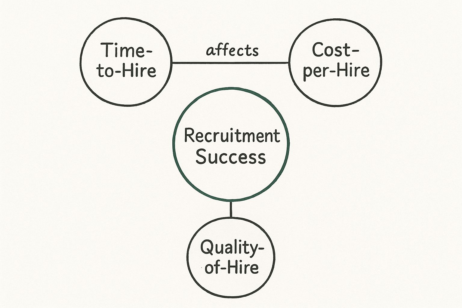
As you can see, a great outcome isn't just about one thing. It's a delicate balance of speed, cost-effectiveness, and the ultimate quality of the person you bring on board.
Your KPIs In The Real World
These metrics don’t live in a vacuum. Recent analysis of over 140 million applications shows that hiring is just getting harder. Teams are now conducting a staggering 42% more interviews per hire than they did back in 2021. All that extra work has pushed the average time-to-hire from 33 days to 41. And despite all that effort, today’s applicant is three times less likely to get hired than they were just three years ago.
This isn't just trivia; it's critical context. Your dashboard needs to tell you if your Time-to-Fill is creeping up because of tough market trends or because your internal process is a disaster. If you want to dig in even more, feel free to explore our guide on other essential recruitment KPIs to track.
The whole point of a dashboard isn’t just to track metrics; it’s to answer questions. "Why did it take 90 days to hire that senior engineer?" "Are we overspending on LinkedIn for mediocre candidates?" That's where the real value is.
By focusing on these core four, your recruitment metrics dashboard stops being a passive report card and becomes an active diagnostic tool. Think of it as your early warning system for a broken pipeline, a bloated budget, or a bad hiring decision just waiting to happen.
How To Build Your Dashboard Without An Engineer

Alright, so how do you actually build this thing? The good news is you don’t need to mortgage the office ping-pong table to afford some custom-built software monstrosity.
The goal isn’t to create the world’s most complex dashboard; it's to create one you'll actually use. Forget the idea that you need a data engineer on standby. Most teams can get 90% of the way there with tools they already have or can easily access.
It’s about being pragmatic, not perfect. Let's walk through the options, from the surprisingly powerful to the purpose-built.
Start With What You Have: The Humble Spreadsheet
Yes, really. Before you roll your eyes, a well-structured Google Sheet or Excel file is a fantastic starting point. It forces you to be disciplined about what data you collect and how you organize it.
It's not glamorous, but it works. This approach is perfect for smaller teams or anyone just dipping their toes into data. It’s manual, sure, but that pain is a great motivator to keep your data clean.
Your first dashboard shouldn’t be your final one. Think of it as a prototype. Use a simple tool to figure out which metrics actually give you those "aha!" moments before you invest in something more powerful.
This is your testing ground. Once you find yourself spending more time updating the spreadsheet than analyzing the data, you’ll know it’s time to graduate.
Level Up: Your Applicant Tracking System
Most modern Applicant Tracking Systems (ATS) have some form of built-in reporting or dashboard functionality. Have you actually explored it? I’m consistently surprised by how many teams pay for a powerful ATS and only use its most basic features.
Dig into your settings. Many platforms offer customizable reports that can track core KPIs like:
- Time-in-Stage: See exactly where candidates are getting stuck in your pipeline.
- Source Effectiveness: Discover which channels are bringing in candidates who actually get hired.
- Funnel Conversion Rates: Track the percentage of candidates moving from one stage to the next.
This is often the path of least resistance. The data is already there; you just need to learn how to visualize it. To see what a best-in-class tool looks like, check out the recruitment dashboard features offered by specialized software. It gives you a great benchmark for what to expect.
The Heavy Hitters: Business Intelligence Tools
Ready for the big leagues? This is where dedicated Business Intelligence (BI) tools like Tableau, Google Data Studio, or Microsoft Power BI come in. Think of these as spreadsheets on steroids.
They can connect directly to your ATS, HRIS, and even survey tools, pulling all your data into one central location. You can then drag and drop to create incredibly detailed, interactive visuals that update in real-time.
The learning curve can be steep, and there's a cost involved. But if you’re serious about data, the power they offer is unmatched for building a truly comprehensive recruitment metrics dashboard.
What Your Dashboard Is Actually Telling You
A dashboard that just throws a bunch of numbers at you is a colossal failure. It’s like a car’s dashboard showing you engine RPM but not your actual speed. Useless.
A great recruitment metrics dashboard tells a story. It connects the dots. It’s the tool that helps you shift from being a reactive recruiter—always putting out fires—to a strategic talent advisor who sees problems coming before they even start.
So, what’s the story your data is trying to tell you? Let's put on our detective hats.
Connecting The Dots To Find The Real Problem
You see your Time-to-Fill is creeping up. The knee-jerk reaction is to blame the market or just tell your team to work faster. Wrong. A good dashboard lets you dig deeper. Is it high across the board, or is it isolated to just one department?
Maybe you notice it's only spiking for the engineering team. Now you're getting warmer. You cross-reference that with your Time-in-Stage metric and—aha!—candidates are getting stuck in the "Hiring Manager Review" stage for an average of 12 days.
Suddenly, the problem isn’t a slow market; it’s a specific hiring manager who’s become a black hole for resumes. Now you have a specific, actionable problem you can solve. You’re not just complaining about a metric; you're diagnosing a bottleneck. This is the difference between data and diagnosis.
A dashboard should provoke questions, not just provide answers. If your data isn't making you ask "why," it's not working hard enough for you.
From Numbers To Narratives
Think of every metric as a clue. When you see one KPI flagging, your very next move should be to see how it correlates with others. It’s like a doctor looking at a patient’s symptoms to figure out the underlying illness.
- Symptom: Your Offer Acceptance Rate just dropped by 15% this quarter.
- Initial Diagnosis: "We're not paying enough!" Maybe. But that's a lazy assumption.
- Deeper Investigation: Let's look at the data. Is the drop tied to a specific role? Are candidates dropping out right after the final interview? Maybe your candidate experience is a total train wreck, and by the time you make an offer, your best people have already been turned off.
This is where a well-built recruitment metrics dashboard becomes indispensable. It allows HR professionals to quickly analyze issues, such as graphing turnover rates by department to find where costs are highest or monitoring diversity goals. Want to learn more about these powerful insights? You can explore how HR dashboards drive strategy on splashbi.com. This kind of analysis turns raw numbers into a clear narrative about what's really happening.
By combining different metrics, you can spot the patterns that reveal the root cause of your hiring headaches, turning data into a clear path forward. If you're looking for more ways to make your hiring more effective, check out our guide on how to improve recruiting efficiency.
Why Real-Time Data Wins The Best Hires

Let’s be honest, that quarterly hiring report you spent a week putting together is a historical document. By the time the slide deck is built and the findings are presented, the data is already stale. It’s an autopsy, not a diagnosis.
The problem is, top talent doesn't hang around waiting for you to analyze last month's numbers. Winning in today's market means making decisions based on what’s happening right now. Shifting from looking in the rearview mirror to looking at the road ahead isn't just a nice-to-have; it's non-negotiable.
This is exactly where a real-time recruitment metrics dashboard changes the game. It turns your hiring process from a slow-moving cargo ship into a nimble speedboat, capable of dodging icebergs and changing course in an instant.
From Autopsy To Action
Getting a live dashboard isn't about micromanaging your team or obsessing over every single click. It's about agility. It’s about spotting problems when they're small, before they snowball into disasters that cost you your best candidates.
Think about it this way: you post a new job ad. With the old-school approach, you might wait two weeks, see disappointing applicant numbers, and only then start troubleshooting. By that point, you’ve lost critical momentum.
With a real-time dashboard, you can spot that broken job ad within hours. You’ll see it’s getting plenty of views but almost zero applications—a classic sign of a misleading title or a busted "Apply" button. You can fix it that afternoon, not next month.
The goal of a real-time dashboard is to shrink the gap between insight and action. The faster you can spot a problem, the faster you can fix it and get back to hiring great people.
The Agility Advantage
This dynamic approach is becoming absolutely critical as time-to-hire remains a top priority for competitive companies. The move toward real-time metrics gives you the instant insights needed to shorten hiring cycles and lock in top talent before anyone else can. You can find more on why this is the key to staying ahead on vultus.com.
A live dashboard delivers this competitive edge by flagging issues the moment they happen:
- Candidate Bottlenecks: Instantly see when a great candidate has been stuck in the "Hiring Manager Review" stage for five days straight. You can nudge the manager before that person accepts another offer.
- Source Performance: Notice a new LinkedIn campaign is driving a ton of unqualified applicants? You can pause the ad spend immediately instead of burning cash until the monthly budget review.
- Offer Acceptance Rates: See a sudden drop in offer acceptance for a specific team? You can dig into whether it’s a compensation issue or something off in the interview process in real-time.
This isn't just about having more data. It's about having the right data at the right time to make smarter, faster decisions. That’s how you win.
Common Dashboard Disasters And How To Avoid Them
We’ve seen it all. The beautiful recruitment dashboard that’s too complicated to actually use. The one with data so dirty it’s useless. And our personal favorite: the "watermelon" dashboard. You know the one—everything looks green on the outside, but drill down and it’s a chaotic mess of red on the inside.
Building a dashboard is easy. Building one that doesn't end up as a digital paperweight is the hard part. Here’s a brutally honest look at the common pitfalls we’ve stumbled into, so you don’t have to.
The Analysis Paralysis Trap
The first disaster is creating a data monster. You track 50 different KPIs, build a dozen custom views, and spend your Monday mornings staring at a kaleidoscope of charts. The result? You spend more time looking at data than acting on it.
This is analysis paralysis, plain and simple. Your dashboard should simplify, not overwhelm. If you can’t glance at it and know your top three priorities for the week, you’ve built a distraction, not a tool.
A dashboard that requires a 30-minute meeting to interpret has already failed. It should provide clarity in seconds, not confusion in hours.
Garbage In, Garbage Out
The second disaster is even more insidious: bad data. If your recruiters aren't consistently tracking candidate sources or updating stages in your ATS, your dashboard is just a pretty front-end for a garbage fire.
Your metrics are only as good as the data feeding them. Inaccurate data leads to terrible decisions, like cutting the one sourcing channel that actually delivers your best hires. You'll end up chasing ghosts, fixing problems that don't exist, and wondering why your efforts aren't paying off. This is a fast track to wasting your budget; our guide on how to reduce recruitment costs offers more insight into making smarter spending decisions.
- The Fix: Make data hygiene a non-negotiable part of your team's workflow.
- The Reality: It's a pain, but the alternative is making critical decisions based on lies.
The biggest disaster of all? Building a dashboard nobody uses. If it doesn't answer the specific, burning questions your execs and hiring managers have, it will be ignored. Build for them, not for your own curiosity.
Your Questions On Recruitment Dashboards Answered
Alright, let's wrap this up with a quick-fire round. I get these questions all the time, so let's cut right to the chase and clear a few things up.
How Do I Start If I Have Zero Data?
You don't. I can pretty much guarantee you have data; it's just a mess right now. It’s lurking in your ATS, scattered across your email outbox, and buried in forgotten spreadsheets.
So, the first step isn’t to build some magnificent recruitment metrics dashboard. It’s much simpler. Start by tracking just three things, and do it consistently for one month: Source of Hire, Time-to-Fill, and who actually got the offer. That's it. That’s your foundation. Don't overcomplicate it.
What's The Single Biggest Mistake People Make?
This one’s easy. They build a dashboard for themselves and not for the people who actually need the answers.
Your CEO doesn't really care about applicant-to-interview ratios. What they want to know is the Cost-per-Hire for the sales team and whether you're on track to hit the Q3 headcount goals. You have to build the dashboard that answers their questions, not just the ones you find interesting.
A dashboard is a communication tool first and an analytics tool second. If it doesn’t speak the language of your audience, it’s just digital noise.
How Do I Prove The ROI Of Building This Thing?
Show them the "before" and "after." It's that simple.
Before, you were spending $5,000 on a job board that delivered exactly zero hires last quarter. After building the dashboard, you spotted this and reallocated that budget to the employee referral program, which consistently delivers the best Quality of Hire.
See? You’re not just showing them charts and graphs. You’re showing them how data led directly to smarter spending. That’s an ROI everyone in the business can understand.
Stop guessing and start hiring with surgical precision. Async Interview gives you the tools to automate your initial screening, gather consistent candidate data, and build a hiring process that’s up to ten times faster. See how it works and start your free trial today.